Adobe Illustrator
Adobe Photoshop
Google Gemini
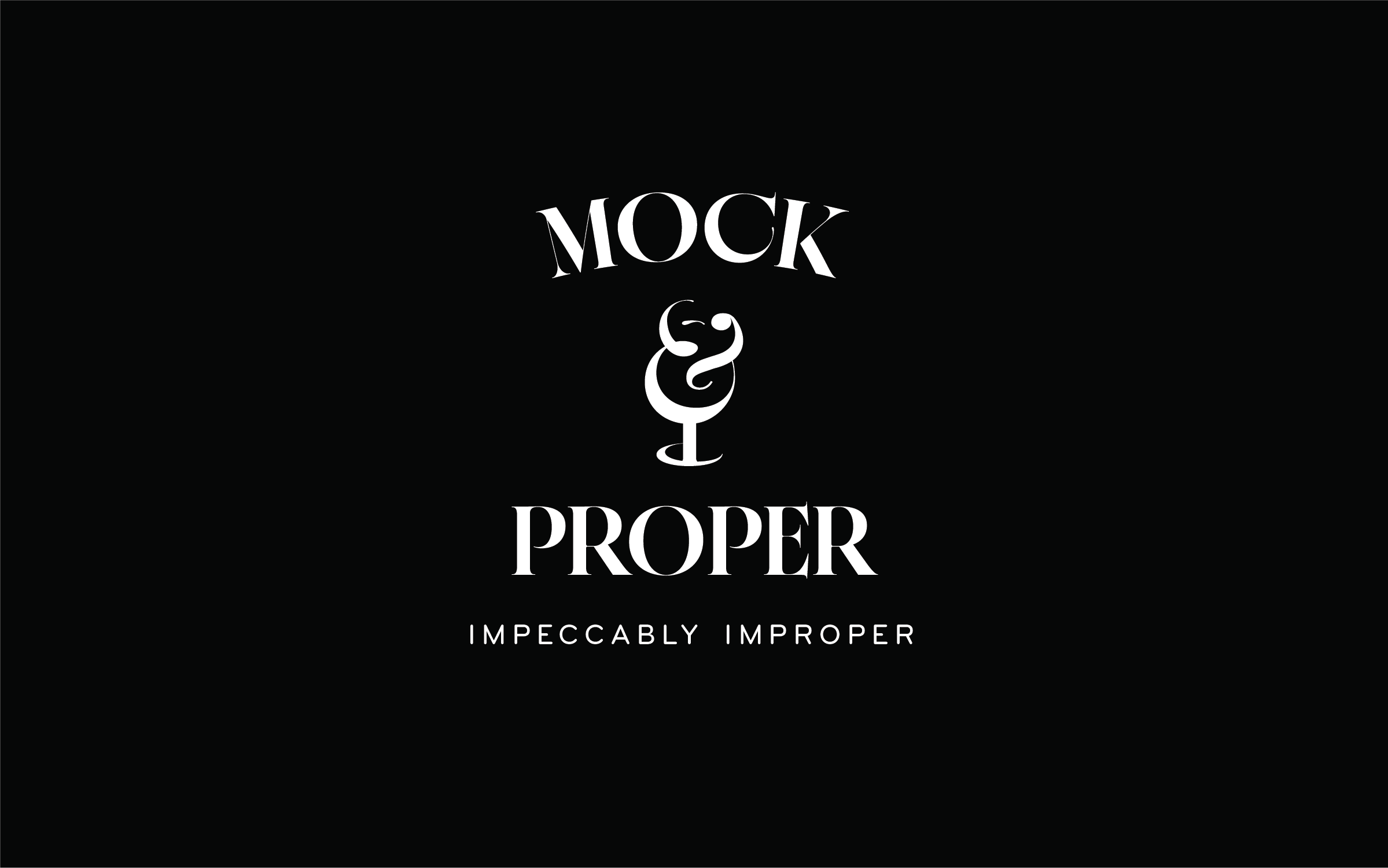
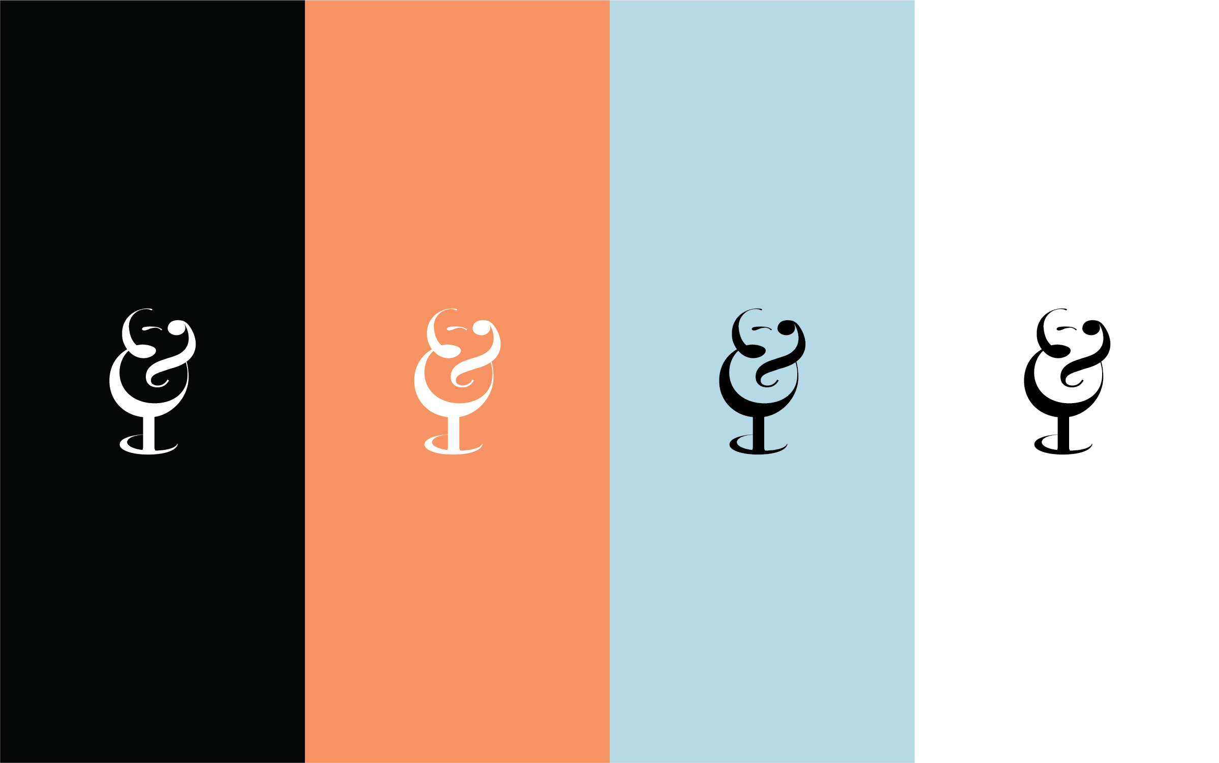
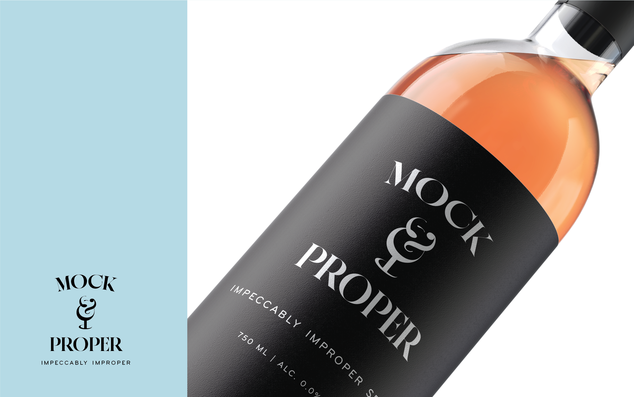
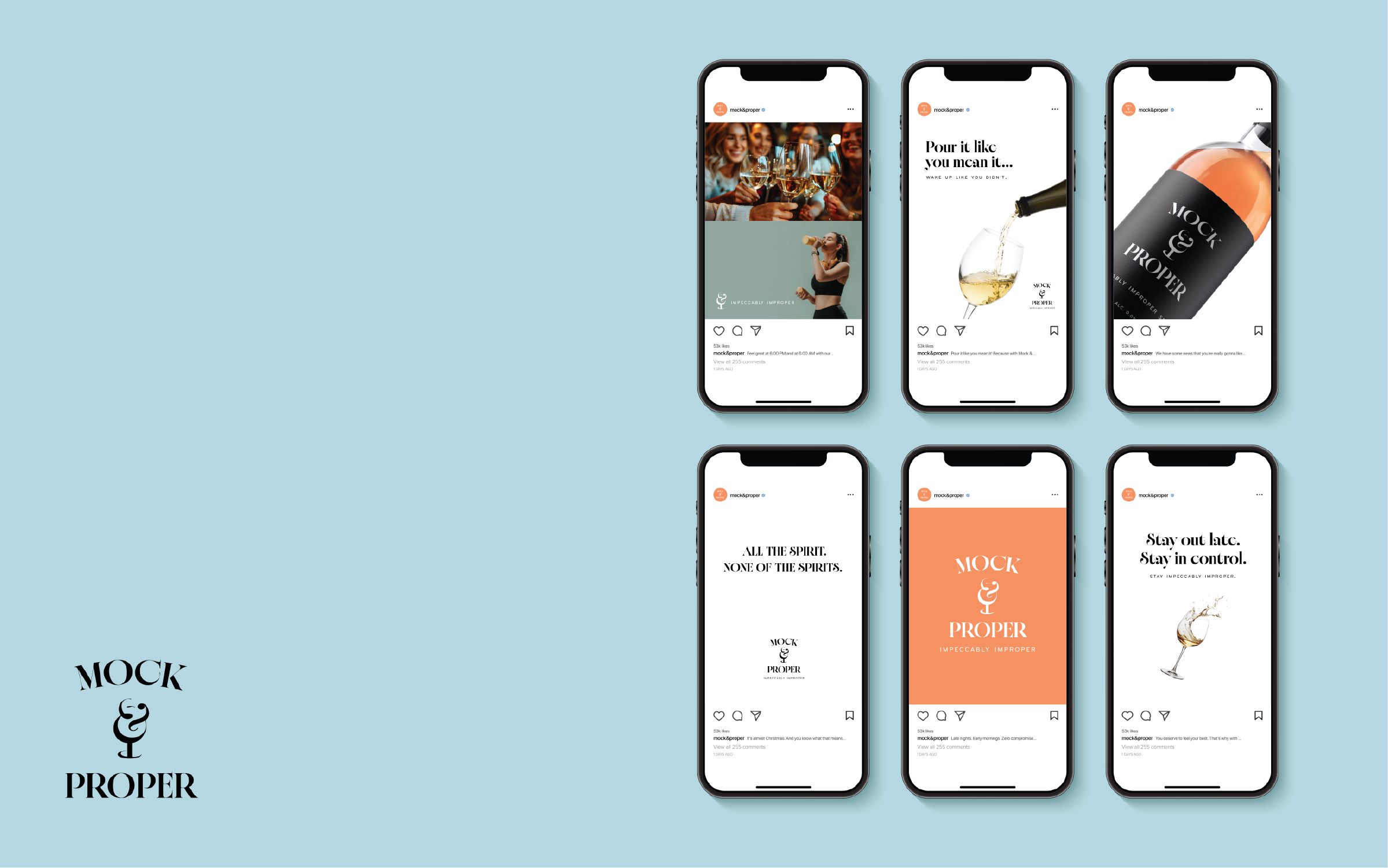
Mock & Proper is for those who love the ritual of a great drink and the energy of a social night out, but value feeling just as good the next morning. Rather than a compromise, the brand positions itself as a premium choice for wellness-minded creatives and young professionals who want to stay socially engaged without the aftereffects. The challenge was to develop a visual language that fits seamlessly within an elevated, "speakeasy" aesthetic, capturing the prestige of a fine spirit without the traditional stuffiness of the wine industry. The visual identity was designed to solve for both ends of the brand’s spectrum: maintaining a sense of quality and elegance while introducing a friendly, playful appeal to set it apart from competitors. To achieve this, I developed a custom ampersand that serves as the brand’s visual signature. At first glance, the mark appears to be sophisticated and "proper," with the base weighted to mirror a wine glass silhouette. However, upon closer inspection, the top of the character reveals a subtle winking face, which nods to the idea that the brand doesn't take itself too seriously. I curated a color palette of soft tangerine and light turquoise, providing a fresh and inviting energy to contrast with the classic black and white typography.
Beyond the logo, I executed a scalable marketing system designed to thrive in high-velocity digital environments. This included a modular social media framework that balances sophisticated typography with vibrant digital assets. This visual system ensures that Mock & Proper commands attention in a crowded feed. This project ultimately showcases a blend of technical execution and a conversion-focused marketing strategy, establishing a cohesive brand voice that translates a complex vision into a compelling consumer experience.