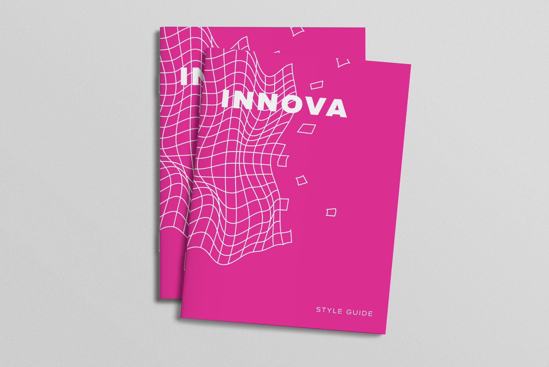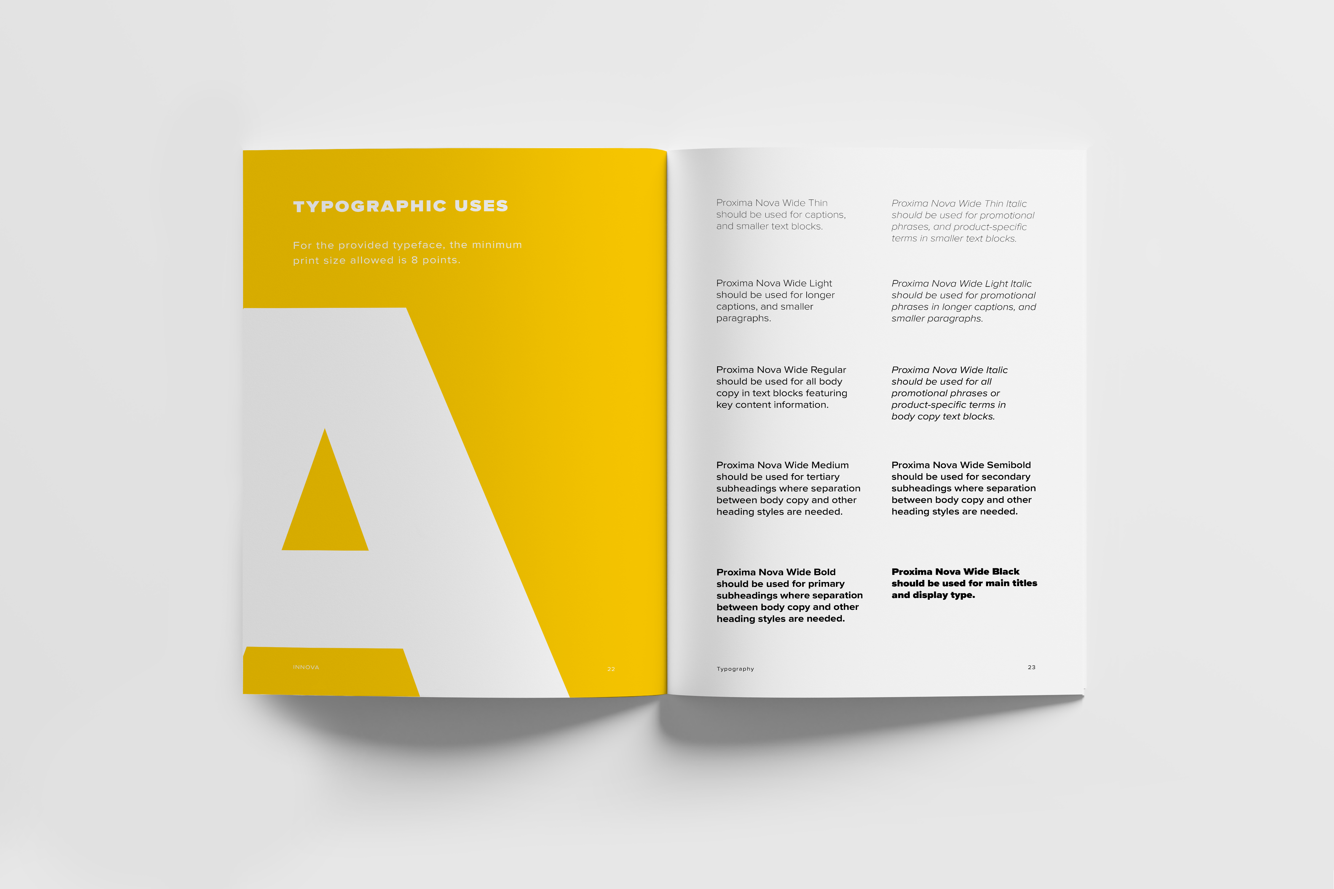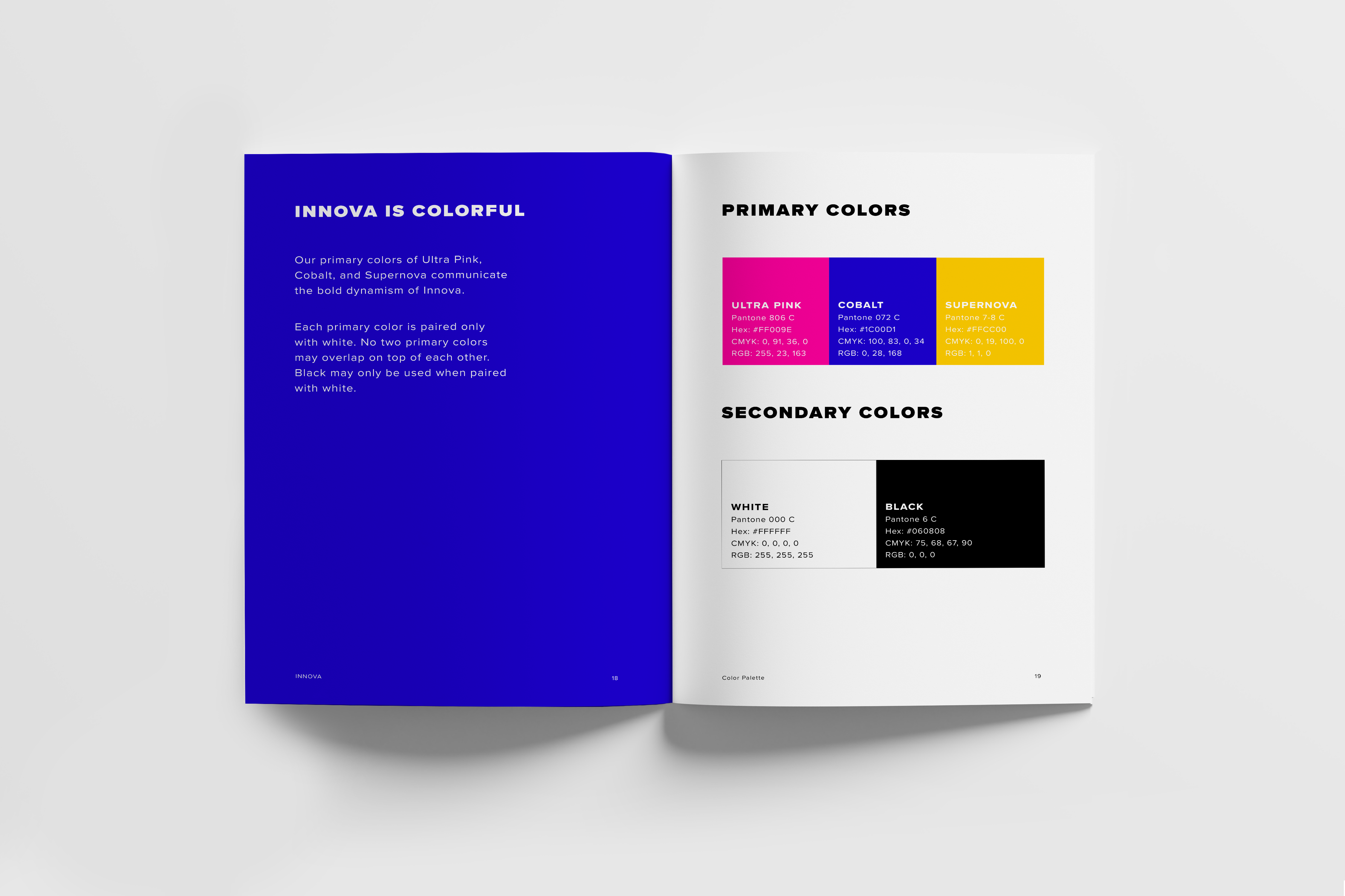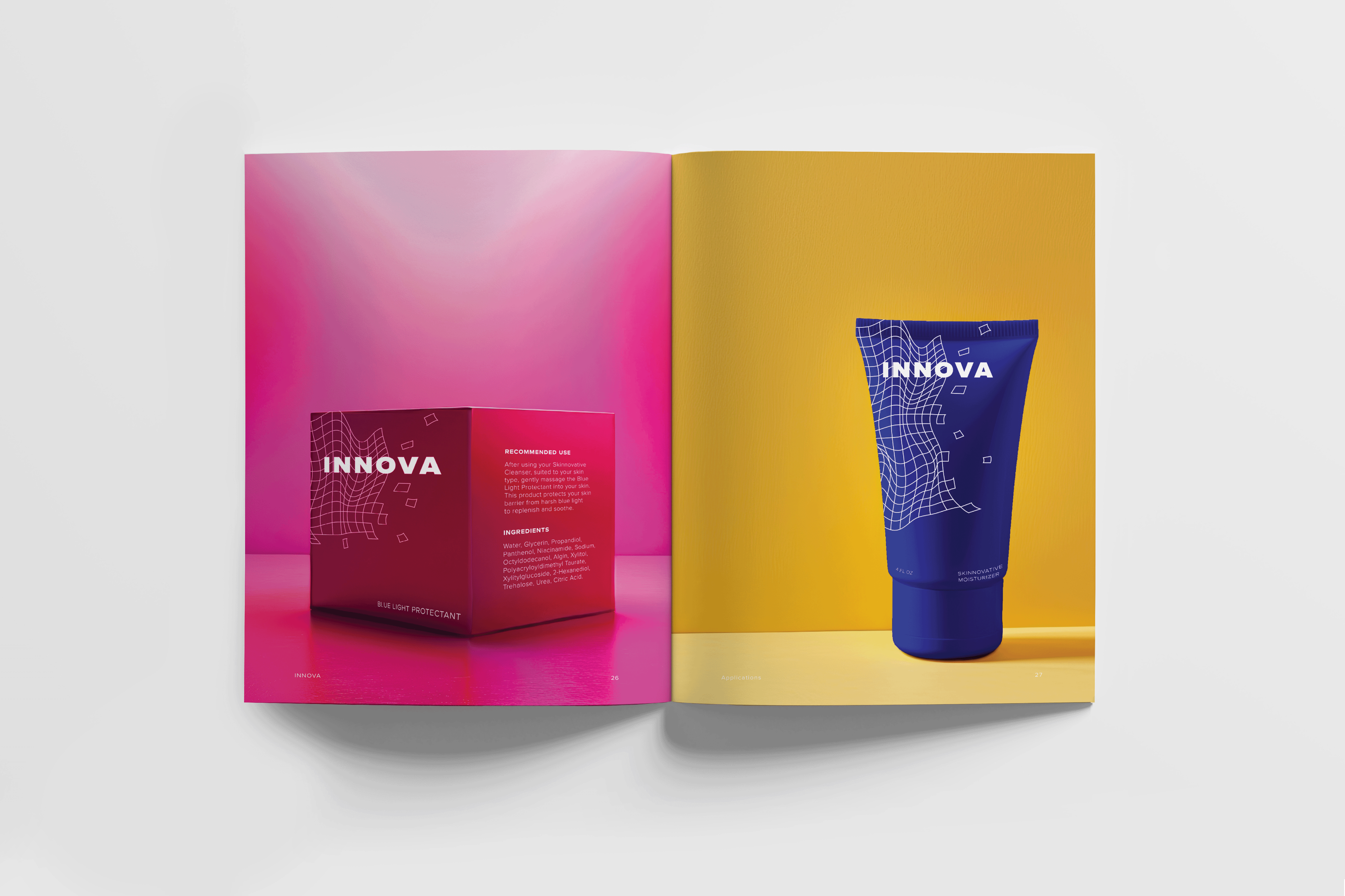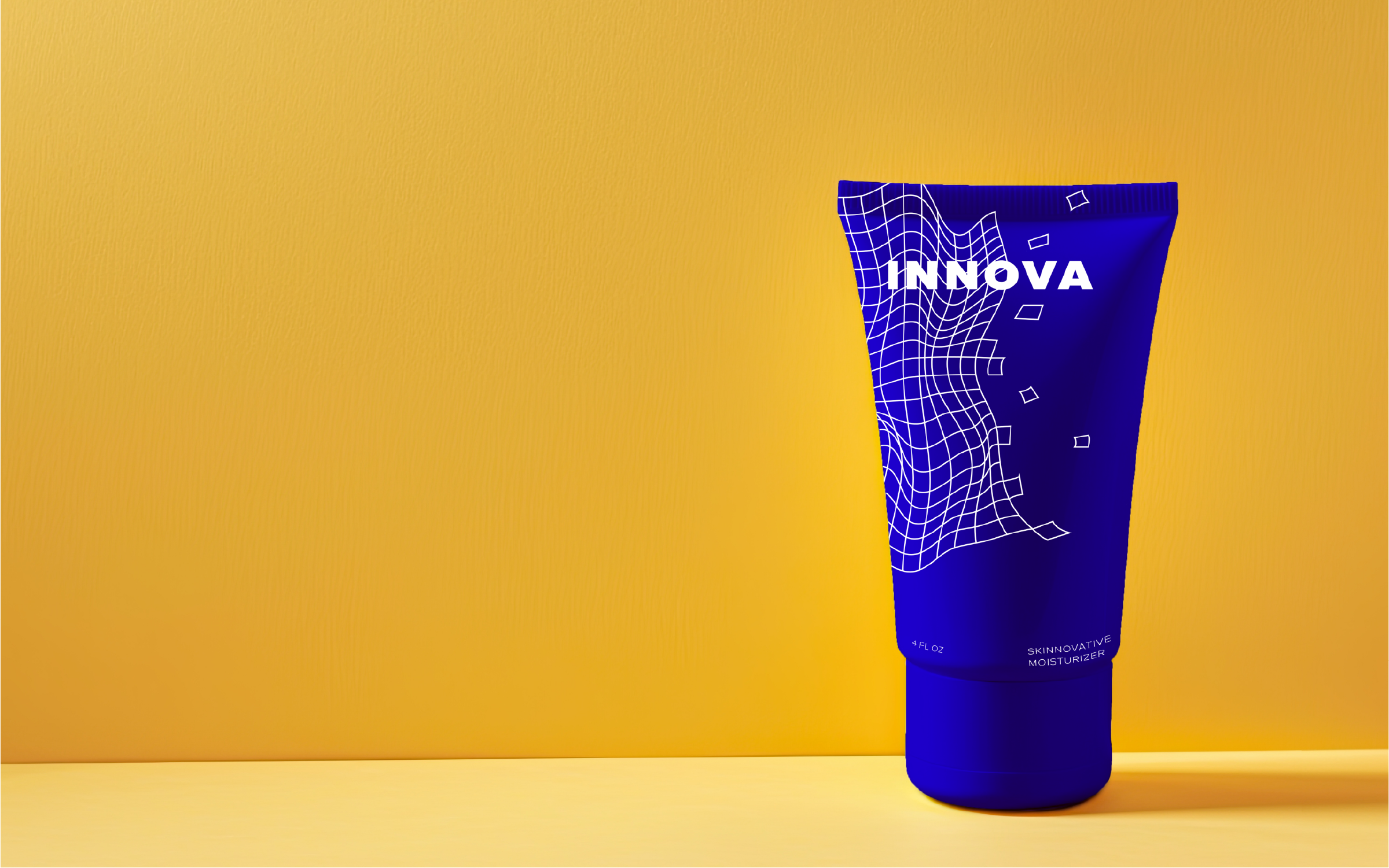
Innova is a skincare company targeted towards the tech-savvy consumer who values data-driven science. The primary challenge was to create a visual identity that felt equally at home in the wellness space and the tech sphere. The logo design utilizes an amorphous grid geometry to represent a strategic blend that simultaneously references pixels and the biological framework of the skin barrier. The strikingly saturated palette was chosen as a strategic departure from the muted aesthetic of competitors, providing a market-differentiating look. The design process included presenting three distinct visual directions to stakeholders (peers). This exercise in structured client feedback led to the final refinement of the brand. The deliverable included a comprehensive brand style guide, detailing systematic regulations for logo usage, typographic hierarchy, and color application. This guide ensures brand integrity and consistency across all future digital and print touchpoints, establishing a cohesive, professional brand architecture for launch.